Copy
The copy and messaging is a core part of the experience of GitLab and the conversation with our users. Follow the below conventions throughout GitLab.
Note: We are currently inconsistent with this guidance. Images below are created to illustrate the point. As this guidance is refined, we will ensure that our experiences align.
Contents
Brevity
Users will skim content, rather than read text carefully. When familiar with a web app, users rely on muscle memory, and may read even less when moving quickly. A good experience should quickly orient a user, regardless of their experience, to the purpose of the current screen. This should happen without the user having to consciously read long strings of text. In general, text is burdensome and adds cognitive load. This is especially pronounced in a powerful productivity tool such as GitLab. We should not rely on words as a crutch to explain the purpose of a screen. The current navigation and composition of the elements on the screen should get the user 95% there, with the remaining 5% being specific elements such as text. This means that, as a rule, copy should be very short. A long message or label is a red flag hinting at design that needs improvement.
Example: Use
Addinstead ofAdd issueas a button label. Preferrably use context and placement of controls to make it obvious what clicking on them will do.
Forms
Adding items
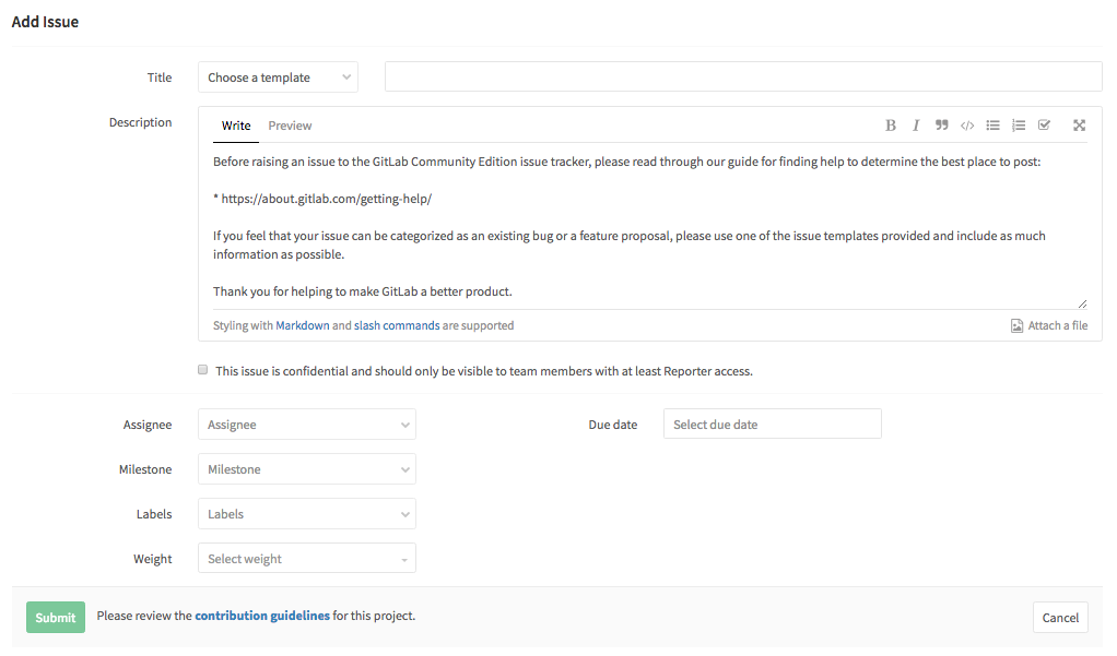
When viewing a list of issues, there is a button that is labeled Add. Given the context in the example, it is clearly referring to issues. If the context were not clear enough, the label could be Add issue. Clicking the button will bring you to the Add issue form. Other add flows should be similar.
The form should be titled Add issue. The submit button should be labeled Save or Submit. Do not use Add, Create, New, or Save Changes. The cancel button should be labeled Cancel. Do not use Back.
Editing items
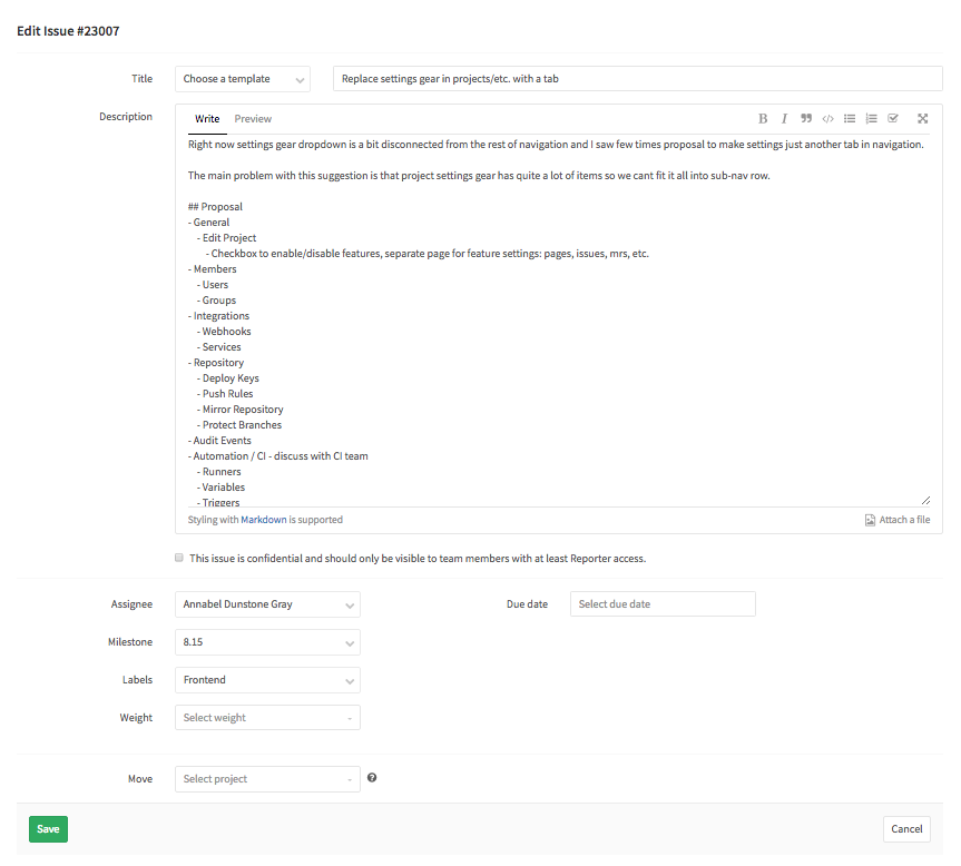
When in context of an issue, the affordance to edit it is labeled Edit. If the context is not clear enough, Edit issue could be considered. Other edit flows should be similar.
The form should be titled Edit Issue. The submit button should be labeled Save. Do not use Edit, Update, New, or Save Changes. The cancel button should be labeled Cancel. Do not use Back.
Terminology
Issues
Adjectives (states)
| Term | Use |
|---|---|
| Open | Issue is active |
| Closed | Issue is no longer active |
Example: Use
5 open issuesand do not use5 pending issues. Only use the adjectives in the table above.
Verbs (actions)
| Term | Use |
|---|---|
| Add | For adding an issue. Do not use create or new
|
| View | View an issue |
| Edit | Edit an issue. Do not use update
|
| Close | Closing an issue |
| Re-open | Re-open an issue. There should never be a need to use open as a verb |
| Delete | Deleting an issue. Do not use remove
|


